Covid19 spreading in a networking model (part I)
Table of Contents
This is a reproduction of a Jupyter notebook you can find here
Introduction#
The Covid19 has imposed a lot of pressure on epidemiologists to come up with models that can explain the impact of pandemics. There already is lot of theory developed around this topic you can check out. In particular, understanding SIR models is really useful to understand how researchers approach the problem of virus spreading. In this notebook, I introduce some ideas about how to use Pandas, plots and graphs to explore the evolution of pandemics. I show some tools you can use to simulate networks dynamics. Of course, this cannot be considered a contribution to the state of the art. However, you may find some interesting guidelines for other problems.
The question#
The main question we ask ourselves is has air passengers something to do with Covid19?. If so, can we use air traffic data to know something else about Covid19 evolution?
It is known that the virus started in China and later propagated around the world. If air traffic has contributed to the spread of the virus, this means that we can somehow leverage a model that explains or predict the evolution of the disease. Furthermore, we could even predict what countries could be potentially infected and/or what flights shall be cancelled.
There is a vast amount of work that can be done in this topic. To make it more accessible we will split it into smaller parts. In this first part, we will explore the data we plan to use and how to work with graphs.
Dataset#
The OpenFlights dataset contains airlines, air routes and airports per country. The information contained in the dataset contains information up to 2014. This may be a bit outdated. However, it is detailed enough for our purposes.
Additionally, we use the Kraggle Covid19 challenge data as we did in our previous Covid19 series.
import pandas as pd
import numpy as np
import plotly.graph_objects as go
import plotly.express as px
import datetime
routes_dataset_url = 'https://raw.githubusercontent.com/jpatokal/openflights/master/data/routes.dat'
airports_dataset_url = 'https://raw.githubusercontent.com/jpatokal/openflights/master/data/airports.dat'
countries_dataset_url = 'https://raw.githubusercontent.com/jpatokal/openflights/master/data/countries.dat'


# Load the file with the routes
routes = pd.read_csv(routes_dataset_url, names=['Airline','AirlineID','SourceAirport',
                                                       'SourceAirportID', 'DestinationAirport', 'DestinationAirportID',
                                                      'CodeShare','Stops','Equipment'],
                     na_values='\\N')
display(routes)


# Load the file with the airports
airports = pd.read_csv(airports_dataset_url, names=['AirportID','Name','City','Country','IATA','ICAO',
                                                         'Latitude', 'Longitude', 'Altitude', 'Timezone', 'DST',
                                                         'TzDatabaseTimeZone', 'Type', 'Source'], index_col='AirportID',
                      na_values='\\N')

display(airports)

# Covid19 data
covid_data = pd.read_csv('covid19-global-forecasting-week-2/train.csv',parse_dates=['Date'],
                   date_parser=lambda x: datetime.datetime.strptime(x, '%Y-%m-%d'))
| Airline | AirlineID | SourceAirport | SourceAirportID | DestinationAirport | DestinationAirportID | CodeShare | Stops | Equipment | |
|---|---|---|---|---|---|---|---|---|---|
| 0 | 2B | 410.0 | AER | 2965.0 | KZN | 2990.0 | NaN | 0 | CR2 |
| 1 | 2B | 410.0 | ASF | 2966.0 | KZN | 2990.0 | NaN | 0 | CR2 |
| 2 | 2B | 410.0 | ASF | 2966.0 | MRV | 2962.0 | NaN | 0 | CR2 |
| 3 | 2B | 410.0 | CEK | 2968.0 | KZN | 2990.0 | NaN | 0 | CR2 |
| 4 | 2B | 410.0 | CEK | 2968.0 | OVB | 4078.0 | NaN | 0 | CR2 |
| ... | ... | ... | ... | ... | ... | ... | ... | ... | ... |
| 67658 | ZL | 4178.0 | WYA | 6334.0 | ADL | 3341.0 | NaN | 0 | SF3 |
| 67659 | ZM | 19016.0 | DME | 4029.0 | FRU | 2912.0 | NaN | 0 | 734 |
| 67660 | ZM | 19016.0 | FRU | 2912.0 | DME | 4029.0 | NaN | 0 | 734 |
| 67661 | ZM | 19016.0 | FRU | 2912.0 | OSS | 2913.0 | NaN | 0 | 734 |
| 67662 | ZM | 19016.0 | OSS | 2913.0 | FRU | 2912.0 | NaN | 0 | 734 |
67663 rows × 9 columns
| Name | City | Country | IATA | ICAO | Latitude | Longitude | Altitude | Timezone | DST | TzDatabaseTimeZone | Type | Source | |
|---|---|---|---|---|---|---|---|---|---|---|---|---|---|
| AirportID | |||||||||||||
| 1 | Goroka Airport | Goroka | Papua New Guinea | GKA | AYGA | -6.081690 | 145.391998 | 5282 | 10.0 | U | Pacific/Port_Moresby | airport | OurAirports |
| 2 | Madang Airport | Madang | Papua New Guinea | MAG | AYMD | -5.207080 | 145.789001 | 20 | 10.0 | U | Pacific/Port_Moresby | airport | OurAirports |
| 3 | Mount Hagen Kagamuga Airport | Mount Hagen | Papua New Guinea | HGU | AYMH | -5.826790 | 144.296005 | 5388 | 10.0 | U | Pacific/Port_Moresby | airport | OurAirports |
| 4 | Nadzab Airport | Nadzab | Papua New Guinea | LAE | AYNZ | -6.569803 | 146.725977 | 239 | 10.0 | U | Pacific/Port_Moresby | airport | OurAirports |
| 5 | Port Moresby Jacksons International Airport | Port Moresby | Papua New Guinea | POM | AYPY | -9.443380 | 147.220001 | 146 | 10.0 | U | Pacific/Port_Moresby | airport | OurAirports |
| ... | ... | ... | ... | ... | ... | ... | ... | ... | ... | ... | ... | ... | ... |
| 14106 | Rogachyovo Air Base | Belaya | Russia | NaN | ULDA | 71.616699 | 52.478298 | 272 | NaN | NaN | NaN | airport | OurAirports |
| 14107 | Ulan-Ude East Airport | Ulan Ude | Russia | NaN | XIUW | 51.849998 | 107.737999 | 1670 | NaN | NaN | NaN | airport | OurAirports |
| 14108 | Krechevitsy Air Base | Novgorod | Russia | NaN | ULLK | 58.625000 | 31.385000 | 85 | NaN | NaN | NaN | airport | OurAirports |
| 14109 | Desierto de Atacama Airport | Copiapo | Chile | CPO | SCAT | -27.261200 | -70.779198 | 670 | NaN | NaN | NaN | airport | OurAirports |
| 14110 | Melitopol Air Base | Melitopol | Ukraine | NaN | UKDM | 46.880001 | 35.305000 | 0 | NaN | NaN | NaN | airport | OurAirports |
7698 rows × 13 columns
# We compute some intermediate dataframes that will be useful later

# Aggregate the number of flights per airport.
# Source_airport -> destination_airport, number of flights
flights_airport = routes.groupby(['SourceAirportID','DestinationAirportID']).size().reset_index(name='num_flights')

# Get the countries for the previous airport IDs
flights_country=flights_airport.join(airports.Country,on='SourceAirportID',lsuffix='Source').\
                join(airports.Country,on='DestinationAirportID',lsuffix='Destination')[['Country','CountryDestination','num_flights']]

# Aggregate the number of flights between countries
# SourceCountry -> DestinationCountry, number of flights
paths = flights_country.groupby(['Country','CountryDestination']).sum()
# Aggregate the number of flights to other countries.
paths_other_countries = flights_country[flights_country.Country != flights_country.CountryDestination].groupby(['Country','CountryDestination']).sum()

# Total number of flights per country
total_flights_country = paths.groupby(['Country']).sum()
# Total number of flights to other countries
total_flights_other_countries = paths_other_countries.groupby(['Country']).sum()
Air routes visualization#
The OpenFlights offers information about the flights between airports. Right now we are only interested in the number of flights between countries. This will simplify the visualization of the air traffic around the globle and it is enough to spot airflights hubs in the dataset.
Note: generating the plot may take a while. However, we added a fancy loading bar :)
# Some code to have a nice progress bar :)
from IPython.display import clear_output

def update_progress(progress):
    bar_length = 20
    if isinstance(progress, int):
        progress = float(progress)
    if not isinstance(progress, float):
        progress = 0
    if progress < 0:
        progress = 0
    if progress >= 1:
        progress = 1

    block = int(round(bar_length * progress))
    clear_output(wait = True)
    text = 'Progress: [{0}] {1:.1f}%'.format( '#' * block + '-' * (bar_length - block), progress * 100)
    print(text)
fig = go.Figure()
total_rows = float(len(paths_other_countries.index))
num_row=-1
for index, row in paths_other_countries.iterrows():

    num_row = num_row + 1
    update_progress(num_row/total_rows)
    fig.add_trace(
        go.Scattergeo(
            locationmode = 'country names',
            locations = index,
            mode = 'lines',
            hoverinfo= 'skip',
            line = dict(width=1,color='red'),
            opacity = float(row['num_flights'])/float(total_flights_other_countries.loc[index[0]]),
            showlegend=False,
        )
    )

fig.update_layout(
    geo = dict(
        showcountries = True,
    ),
    showlegend = False,
    title = 'Aggregated air routes between countries excluding domestic flights'
)

fig.show(renderer='svg')
Progress: [####################] 100.0%

If the air traffic has something to do with the Covid19 spread then, China’s air traffic requires our attention. The figure below shows the routes between China and other countries excluding domestic flights. The wide of every line is representative of the number of flights between countries.
Excluding domestic flights (which are quite a few), China has connections to 62 countries. Assuming daily flights, this means that an infected passenger can propagate the disease around the globe in a few hours.
aux = paths_other_countries.reset_index()
aux = aux[aux.Country=='China']


fig = go.Figure()

total_rows = float(len(aux.index))
num_row=-1

the_min = aux.num_flights.min()
the_max = aux.num_flights.max()
the_mean = aux.num_flights.mean()
the_std = aux.num_flights.std()
scalator = float(the_max - the_min)

for index, row in aux.iterrows():
    num_row = num_row + 1
    update_progress(num_row/total_rows)
    width = ((float(row['num_flights'])-the_min)/scalator)*15
    #width = np.max([0.5, width])

    fig.add_trace(
        go.Scattergeo(
            locationmode = 'country names',
            locations = [row.Country,row.CountryDestination],
            mode = 'lines',
            hoverinfo= 'skip',
            line = dict(width=width,color='red'),
            showlegend=False,
        )
    )


fig.update_layout(
    geo = dict(
        showcountries = True,
    ),
    showlegend = False,
    title = 'China aggregated air routes between countries excluding domestic flights'
)

fig.show(renderer='svg')
Progress: [####################] 98.4%

Disseminations with graphs#
Now that we have a better understanding of our dataset and how does it look, it is time to prepare some artifacts to study the spread of the virus. In this case, we are going to translate our Pandas tables into a graph that represents the network of countries connected by their flights.
We can create a directed graph $G(V,E)$ where the set of vertices $V$ represents the countries and the set of edges $E$ represents existing air routes between countries $A$ and $B$. Additionally, we can set weights $W(E)$ with the number of flights between two countries.
There are some nice libraries to work with graphs in Python. However, I particularly like Graph Tool, maintained by Tiago de Paula Peixoto from the Central European University. It has implementations of some sophisticated algorithms done in C++ with OpenMP.
# Run this to ensure that the drawing module is correctly stablished
from graph_tool.all import *
import graph_tool as gt
g = gt.Graph()

# Create the country property with the country names
countries_prop = g.new_vertex_property('string')
g.vertex_properties['country'] = countries_prop

# Total number of outgoing flights per vertex
out_flights_prop = g.new_vertex_property('int')
g.vertex_properties['out_flights'] = out_flights_prop

# Create edge property with the number of flights between countries
num_flights_prop = g.new_edge_property('double')
g.edge_properties['num_flights'] = num_flights_prop

# Get the complete list of countries
list_countries = np.union1d(paths.reset_index().Country.unique(), paths.reset_index().CountryDestination.unique())

g.add_vertex(len(list_countries))

# For a given country, get the vertex
country_vertex = {}
index=0
#for c in total_flights_country.index:
for c in list_countries:
    v = g.vertex(index)
    countries_prop[v] = c
    country_vertex[c] = v
    # skip self-loops
    try:
        out_flights_prop[v] = total_flights_other_countries.loc[c]['num_flights']
    except:
        out_flights_prop[v] = 0.0

    index=index+1


# Add the edges
for index,num_flights in paths.iterrows():
    s = country_vertex[index[0]]
    d = country_vertex[index[1]]
    # No self-loops
    if s != d:
        e = g.add_edge(s,d)
        num_flights_prop[e] = num_flights
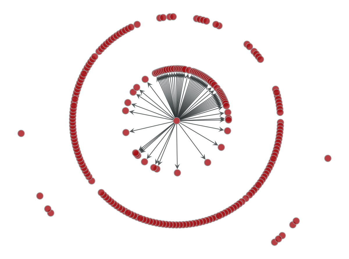
We draw our graph using a radial layout with China in the center. The edges correspond to the neighbors that can be reached in a single step from China. This is, the 62 countries with direct flights from China.
# plot with a radial distribution with China in the center
china_vertex = country_vertex['China']

pos = gt.draw.radial_tree_layout(g,china_vertex)
gv = gt.GraphView(g, efilt=lambda e : e.source()==china_vertex)

p=gt.draw.graph_draw(gv,pos)
Considering a dissemination scenario, we draw the edges for all the countries that can be reached after a scale in a flight from China. As you can see the number is particularly large.
second_step = []
for v in g.get_out_neighbors(china_vertex):
    second_step.append(v)

gv2 = gt.GraphView(g, efilt=lambda e : e.target!=china_vertex and e.source() in second_step)
p=gt.draw.graph_draw(gv2,pos)
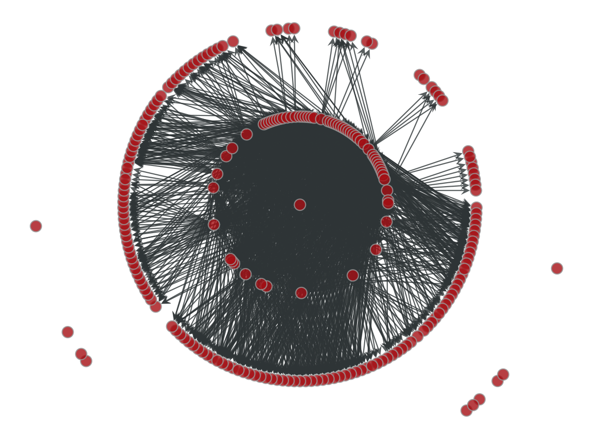
The graph above is a bit misleading. Not all the vertices will be reached from the root vertex (China) with the same probability. In other words, the frequency of flights between countries will increase the probabilities to transfer an infected passenger from China.
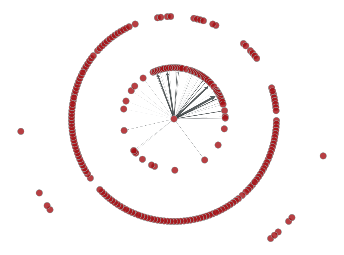
If we consider the weight $W$ of every edge to be the number of outgoing flights following the edge direction, everything becomes more interesting. The figure below changes the width of every edge connecting China with its flight-connected neighbors. A few number of countries (Taiwan, South Korea, Japan) accumulates most of China’s outgoing traffic as the wide arrows show.
Note: in the figure below the $W$ weight is normalized. Otherwise, most of the connections would not be plotted.
aux = gv.edge_properties['num_flights'].copy()

aux.a = (aux.a - aux.a.min())/(aux.a.max()-aux.a.min()) * 10
p=gt.draw.graph_draw(gv,pos,edge_pen_width=aux)
SIR epidemic process#
The SIR model is a simple, yet powerful, compartimental model for epidemics. The model consists of three compartments $S$, $I$ and $R$. $S$ is the number of susceptible, $I$ the number of infectuous and $R$ the number of recovered or deceased individuals. This is the most common model used right now and has many extensions and enhancements. The number of individuals in $S$ falls down as they become infected ($I$) and then recovered $R$. This is one of the famous infection curves used to forecast Covid19 evolution.
How to determine when a new individual moves between compartments depends on transition rates. Continuing with our initial idea about how air traffic can be an important actor in Covid19 dissemination, we can use our air flight connections graph to run a SIR simulation.
Fortunately, graph tool comes with an implementation of the SIR model easily configurable. We run a SIR model in 63 steps which is the number of days the Covid19 required to expand worldwide in our dataset. For every edge in our graph we compute $\beta_e = \sum_{J \in out(A)} W(A,J)$ that basically sets the transition between vertices as the ratio of flights that connection represent among the total number of outgoing flights in vertex $A$. Additionally, we configure SIR to remove spontaneous infections and reinfections and set China as the dissemination seed.
def runSIR(state,num_iter=100):
    '''
    For a graph tool epidemic model run the state and return a dataframe with the countries infected in every step
    '''
    infections = pd.DataFrame()

    previous = state.get_state().fa
    initial = np.where(previous==1)[0]

    for t in range(num_iter):
        ret=state.iterate_sync()
        new = state.get_state().fa
        # Find new infected countries
        diff = new - previous
        already_infected = state.get_state().fa.sum()
        non_infected = len(state.get_state().fa)-already_infected
        new_infected = [countries_prop[g.vertex(v)] for v in np.where(diff==1)[0]]
        previous = new.copy()
        # collect the results in a Pandas friendly way
        infections = infections.append([{'step':t,'norm_steps':t/float(num_iter),'infected':already_infected,
                                'new_infected': len(new_infected),'non_infected': non_infected,
                                'new_infected_countries': new_infected}], ignore_index=True)

    return infections
# Create an edge property map that can help us to define the beta probability between vertices
beta_prop = g.new_edge_property('double')
for e in g.edges():
    beta_prop[e] = num_flights_prop[e]/out_flights_prop[e.source()]

# Assume that vertices are not susceptible, except the seed.
susceptible_prop = g.new_vertex_property('float')
for v in g.vertices():
       susceptible_prop[v] = 0.0
susceptible_prop[china_vertex]=1.0
state = gt.dynamics.SIRState(g, beta=beta_prop,v0 = china_vertex, constant_beta=True,gamma=0,
                              r=0,s=susceptible_prop,epsilon=0,)

infections_SIR = runSIR(state,64)
display(infections_SIR[infections_SIR.new_infected>0].head(10))
| step | norm_steps | infected | new_infected | non_infected | new_infected_countries | |
|---|---|---|---|---|---|---|
| 1 | 1 | 0.015625 | 8 | 5 | 217 | [Australia, India, Indonesia, Kyrgyzstan, Sout... |
| 2 | 2 | 0.031250 | 13 | 5 | 212 | [Israel, Russia, Saudi Arabia, Thailand, Unite... |
| 3 | 3 | 0.046875 | 20 | 7 | 205 | [Egypt, Hong Kong, Malaysia, Taiwan, Turkey, U... |
| 4 | 4 | 0.062500 | 27 | 7 | 198 | [Burma, France, Germany, Pakistan, Peru, Polan... |
| 5 | 5 | 0.078125 | 36 | 9 | 189 | [Austria, Belarus, Denmark, Kenya, New Zealand... |
| 6 | 6 | 0.093750 | 50 | 14 | 175 | [Argentina, Bosnia and Herzegovina, Brazil, Ca... |
| 7 | 7 | 0.109375 | 59 | 9 | 166 | [Ethiopia, Greece, Greenland, Italy, Libya, Ma... |
| 8 | 8 | 0.125000 | 71 | 12 | 154 | [Bangladesh, Belgium, Cambodia, Chile, Colombi... |
| 9 | 9 | 0.140625 | 79 | 8 | 146 | [Azerbaijan, Bahrain, Czech Republic, Jordan, ... |
| 10 | 10 | 0.156250 | 86 | 7 | 139 | [Dominican Republic, Ecuador, Iran, Lebanon, M... |
The output above shows the number of infected countries over time. Observe that it takes a while for the network to consider new infected countries.
It is interesting to compare our outcomes with the current Covid19 evolution per country. We consider in our dataset that a country is infected as soon as it confirms a single case. We assume that every day after the first case appeared in China can be considered as a step in the dissemination process. This assumption is done in order to facilitate the comparison with our SIR simulation.
# Compute the number of infected countries
# Get the first date with confirmed cases for every country
first_date = covid_data[covid_data.ConfirmedCases > 0].groupby('Country_Region', as_index=False).Date.min().sort_values(by='Date')
# Compute the number of elapsed days since the beginning of China's outbreak
first_date['step']=first_date.Date-datetime.datetime(2020,1,22)
# Convert this column into an integer with the number of days.
first_date.step = first_date.step.dt.days
# Get the number of infected countries per region
covid_infected = first_date[['step','Country_Region']].groupby('step').agg(new_infected=('step','count'))
covid_infected['infected'] = covid_infected['new_infected'].cumsum()
covid_infected = covid_infected.reset_index()
f = go.Figure()
f.add_trace(
    go.Scatter(x=covid_infected.step,y=covid_infected.infected,name='Covid19')
)
f.add_trace(
    go.Scatter(x=infections_SIR.step,y=infections_SIR.infected,name='SIR')
)
f.update_layout(
    title_text='Comparing SIR infected countries evolution with original Covid19',
    xaxis=dict(title='Step'),
    yaxis=dict(title='Infected countries')
)

f.show(renderer='svg')

The original Covid19 evolution differs in the first steps with our SIR simulation. The initial plateau before the increasing slope, takes much longer in the Covid19 series. There is probably a lag between a country welcoming infected passengers and the declaration of that case. However, it is interesting to observe this difference between the number of declared cases and the evolution of our model. Obviously, there is some remaining exploration work before we can understanding why this is happening.
Conclusions#
In this notebook we have introduced some interesting tools to analyze the influence of air flights in the dissemination of the Covid19 around the world. Firstly, we have explored the OpenFlights dataset containing air traffic information around the world. Second, we have used this dataset to create an air traffic network. Finally, we have used this network to run a SIR model to understand the dissemination of the virus using air connections.
References#
Tiago P. Peixoto, “The graph-tool python library”, figshare. (2014) DOI: 10.6084/m9.figshare.1164194 sci-hub